Manual entry dashboard
Monday 13 December 2021
The Manual entry dashboard is designed for those companies that expect to see their drivers adding manual entries to their driver cards to show activities at the start and end of shifts, during shifts where there are gaps between traces, and to record overnight or weekly rest.
The new dashboard can be set to run for any date range and allows you to set a time frame for the length of manual entries to be shown at the start and end of the shift. The following KPI’s are available and can be shown as an average, percentage (default) or value:
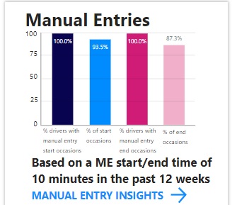
- Occasions and drivers who have not met the criteria for manual entries at the start of a shift
- Occasions and drivers who have not met the criteria for manual entries at the end of a shift
- Occasions and drivers where gaps during shifts have not been filled with a manual entry
- Occasions and drivers where overnight rests have not been recorded.
- Each of the KPI’s can be switched to show those drivers and occasions where the criteria have been met.
Using the Manual entry dashboard
You can access the dashboard if you have the Advanced editor role or higher. Click Tacho dashboard and select the Manual entries tile:
Click “Manual entry insights” to access the dashboard:
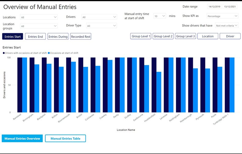 The overview page defaults to give a view of drivers and occasions where a default 10 minutes of manual entry has not been met at the start of a shift for a 2-year date range. The 10 minute parameter can be amended to fit your companies requirements. The default shows results as a percentage but this can also be amended to show results by average or value. You can edit the screen to view results for a specific date range, location group, location and driver as well clicking the buttons across the top of the graph to view each of the different KPIs:
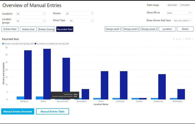
In the example below the dates have been altered to show information for the whole company from 04/01/2021-31/01/21 showing “Recorded rest” information. This shows those drivers and occasion where no overnight or weekly rest has been recorded. The results are shown as a value. The bar graph shows how many drivers have not met the recorded rest criteria in the date range in dark blue, and the light blue shows the number of times or occasions they have not met the criteria in the date range:
The information can also be changed to show information for reporting hierarchies by clicking the group buttons, but this will only work if you have reporting hierarchies set up.
The Manual entry table gives a numerical view of performance against the KPI’s for a specific location group, location or drivers displaying the information in a value, average or as a percentage.
The table will update and adapt its columns according to which criteria are selected:
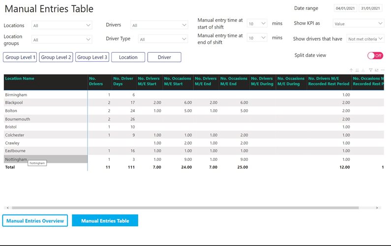 The table has the advantage of showing results for all the KPI’s at once. Again, on this screen you can display the information by average, percentage or value as well being able to adjust the manual entry at start and end criteria.
The split daily view breaks down the information further to show either number of drivers or number of occasions the KPI has not been met within a week based on the date range set:
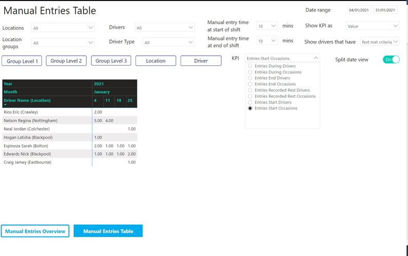 The example above shows the number of occasions drivers have not met the 10 minute manual entry start criteria between 04/01/2021 and 31/01/2021. The selection can be amended to look at the details for each of the KPI’s.
